Claude Dashboards vs Power BI
I built a dashboard with Anthropic’s new Claude Dashboards. With the right setup, it’s a better report builder than I expected. It sits on a much thinner platform, though, and instead of competing with Power BI, I actually think it works well alongside it.
On 8 October 2026 Anthropic launched Claude Dashboards: you describe the dashboard you want, and Claude writes the queries, builds the page and, in Anthropic’s words, keeps it current as the data changes (a live dashboard re-runs its queries whenever someone opens, refreshes or filters it). It’s in beta, on paid Claude plans (Anthropic’s announcement).
As a Power BI developer my first question was obvious: is Claude a BI tool now? So I did what I always do with a new feature and built something real with it. I gave it a challenge dataset and a design brief in the afternoon, and by the next morning I had an eight-tab dashboard. I was pretty impressed by the output.
Then I checked it against Power BI, 30 capabilities in all, with every mark sourced and dated.
The short version: for building the report, Claude Dashboards keeps up with Power BI on most rows (maps are the gap). For running it as a platform (the semantic model, security, refresh, deployment and distribution) Power BI is miles ahead. And the more I dug in, the more the two looked like they fit together, because Claude Dashboards works best sitting on top of a good semantic model.
For simplicity, this article only compares Claude Dashboards with Power BI. Tableau is still very much a competitor (and Anthropic lists it as a “coming soon” place to send a dashboard on to), but three columns made the table too big to read.
What I built
The data is the ZoomCharts Power BI Challenge for September 2026: an e-commerce profitability workbook with 9,109 order lines across 2024 and 2025. I gave Claude the Excel file and the challenge brief, and told it to ignore the references to Power BI and ZoomCharts.
What came back has eight tabs in the brief’s order (Overview, Products, Returns, Promotions, Customers, Channels and markets, Fulfillment, Inventory) under one row of filters for year, region, channel and category. Every headline is a full sentence worked out from the data, and it updates with the filters. Click a category bar on the Products tab and it sets the dashboard’s Category filter; click it again to clear it.
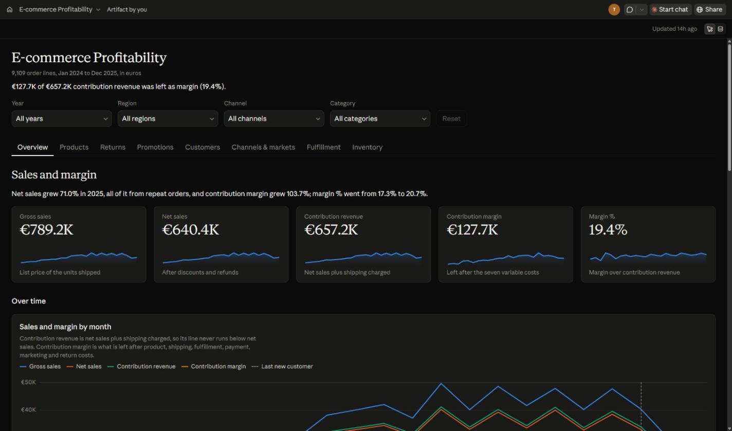
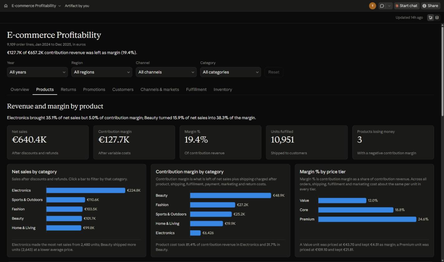
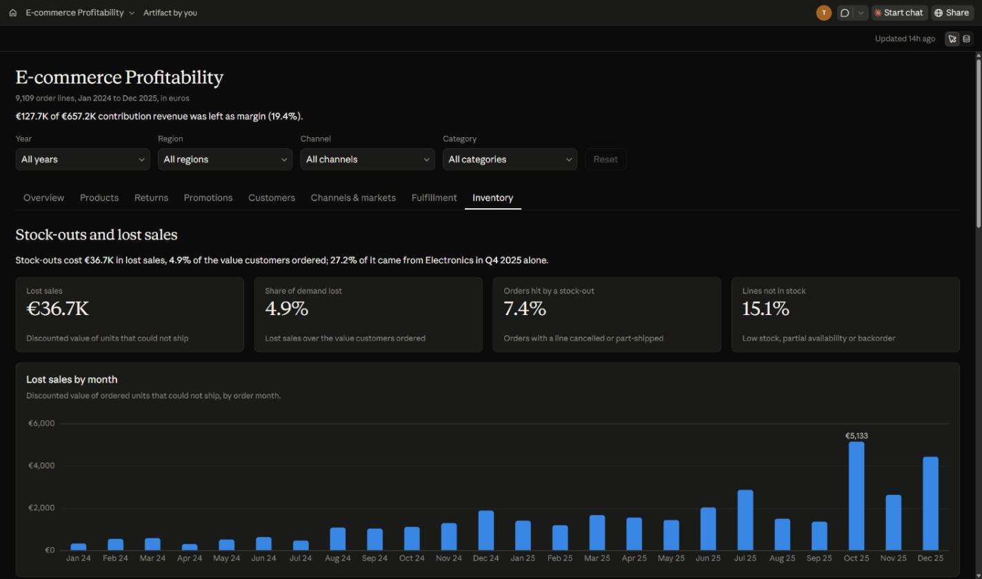
You can open it yourself: E-commerce Profitability on Claude. One catch: you have to be signed in to Claude to see it at all. In a signed-out browser the page opens but stays empty (“Nothing on this dashboard yet”) and asks you to sign in to see the artifact’s data, which is why the recording is here. Signed in, any Claude account should do: its share settings say anyone signed in to Claude can read its data.
What it actually took
For the build I typed three messages: the prompt with the brief pasted in, “Go with all the recommendations.” and a small settings tweak. Here’s the prompt, word for word (typo and all):
make a dashboard from the e-commerce Excel file in this directory. If you need to change it to a CSV file, then you can do that. Ignore the Power BI project that is in this directory and start the dashbaord fresh. this is the design brief, ignore the references to power bi and ZoomCharts [the ZoomCharts challenge brief, pasted in full]
That’s the prompting effort, and it really was very little. The build effort is a different story, and it’s only fair to show it. I didn’t use the claude.ai chat for this one: I built it in Claude Code (Opus 5.5) with the Dashboard artifact type, and Claude Code split the work across four multi-agent workflows.
| Workflow | Agents | Run time |
|---|---|---|
| Data triage | 12 | 153 min |
| Design kit and page briefs | 9 | 125 min |
| Eight page builders | 8 | 198 min |
| Eight adversarial reviewers | 8 | 209 min |
| Total | 37 | about 11.4 hours |
That’s 37 agents and 5,130 tool calls, within about 15 hours 16 minutes of my prompt (to when I asked how long it took). The final checks opened all eight tabs at 1440, 1024 and 420 px wide, in light and dark (48 runs), and matched 6,214 numbers to the data; then 40 filter scenarios matched another 4,748 numbers without a single mismatch.
And the tokens: across 4,065 API calls the build processed about 989 million tokens. Before that number scares you, 97% of it (959.6 million) was cache reads, which cost a fraction of fresh input. At Claude Opus 5.5 list prices on 15 October 2026 the whole build comes to US$357.62 (cache reads $191.92, cache writes $152.12, output $13.55, input $0.03). My Claude plan covered it, so I didn’t actually pay that, but it’s the honest figure for what the build used.
One big caveat
My Claude Code setup isn’t a fresh install. The skills, hooks and checks around it have built a lot of Power BI reports and dashboards for me, and they’ve matured with every one. So the quality here could be as much about my setup as about Claude Dashboards: someone else’s Claude Code, running in a different environment, might get a quite different result from the same prompt.
What a plain claude.ai run gets
So what do you get without any of that? I gave a fresh claude.ai chat, on my normal plan, the same Excel file and the same brief in a single prompt: the one above without the line about the Power BI project, plus “for any questions, go with recommendations” (so it never needed a follow-up) and a note to make a new artifact rather than update my first one. It was done in under an hour, against about 15 hours for my Claude Code build.
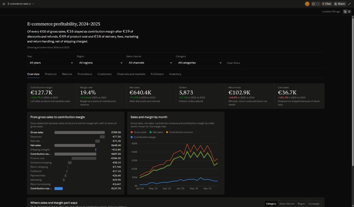
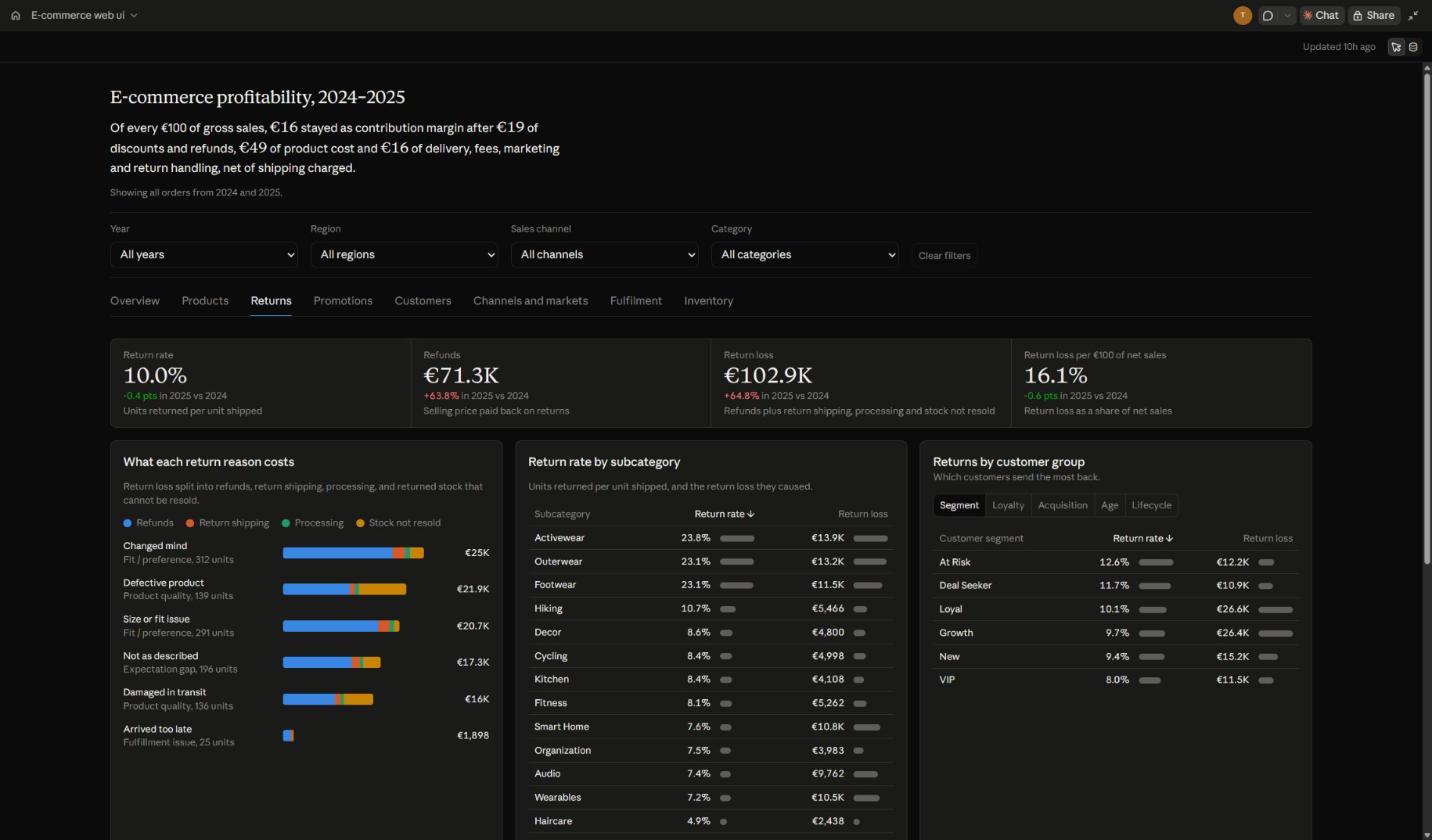
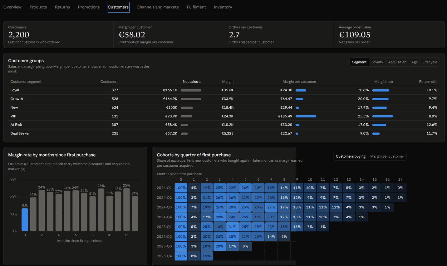
The short answer: a substantially worse report. To be fair to it, it got a lot right. It has the same eight tabs and the same four filters, and its headline figures match mine (€127.7K contribution margin, 19.4% margin, €640.4K net sales, €36.7K lost sales). You can open the plain run’s dashboard too, with the same sign-in catch.
Where it falls down is everything my setup checks for:
- It describes instead of telling. My dashboard leads every tab with a finding (“Electronics brought 35.1% of net sales but 5.0% of contribution margin”). The plain run has one summary sentence that stays at the top of every tab, and its captions say what a chart shows (“Units returned per unit shipped, and the return loss they caused”) rather than what it found.
- The layout has holes. Rows leave a third of the width empty, cards stretch over dead space, and two labels in the Overview’s bar chart are cut off. On the Customers tab the cohort chart runs right out of its card.
- It doesn’t check its own work by default. The Dashboard type tells Claude not to render or screenshot the dashboard unless you ask, so nothing looks at the page the way a reader will. My setup did the opposite: it opened every tab at three widths, in light and dark, and matched more than 10,000 numbers back to the data.
One thing it did backs up the JavaScript point below: it built a star schema in JavaScript. It attached all nine sheets as separate files, wrote a calc that joins every order line to its product, customer, market, promotion and the rest (its own comment calls them “the star schema’s relationships”), and then, just like mine, worked out every metric for every filter combination up front. That’s a semantic model, rebuilt by hand inside one dashboard.
So the caveat above holds up. The dashboard feature is the same in both runs (the plain run even had a newer release of it); the gap is everything around it.
Why the logic matters: JavaScript vs DAX
This is the bit Power BI people will care about. Click any number in a Claude dashboard and the Sources pane shows how it was worked out: the query, the transform and the result, the JavaScript behind it, or the file it was read from. That’s a great feature. Power BI shows authors the DAX behind a visual in Performance Analyzer, and Copilot with Fabric IQ can show DAX, but I couldn’t find a built-in way for a viewer to click a number and see its query.
Here’s what clicking Margin % (19.4%) on my dashboard shows:
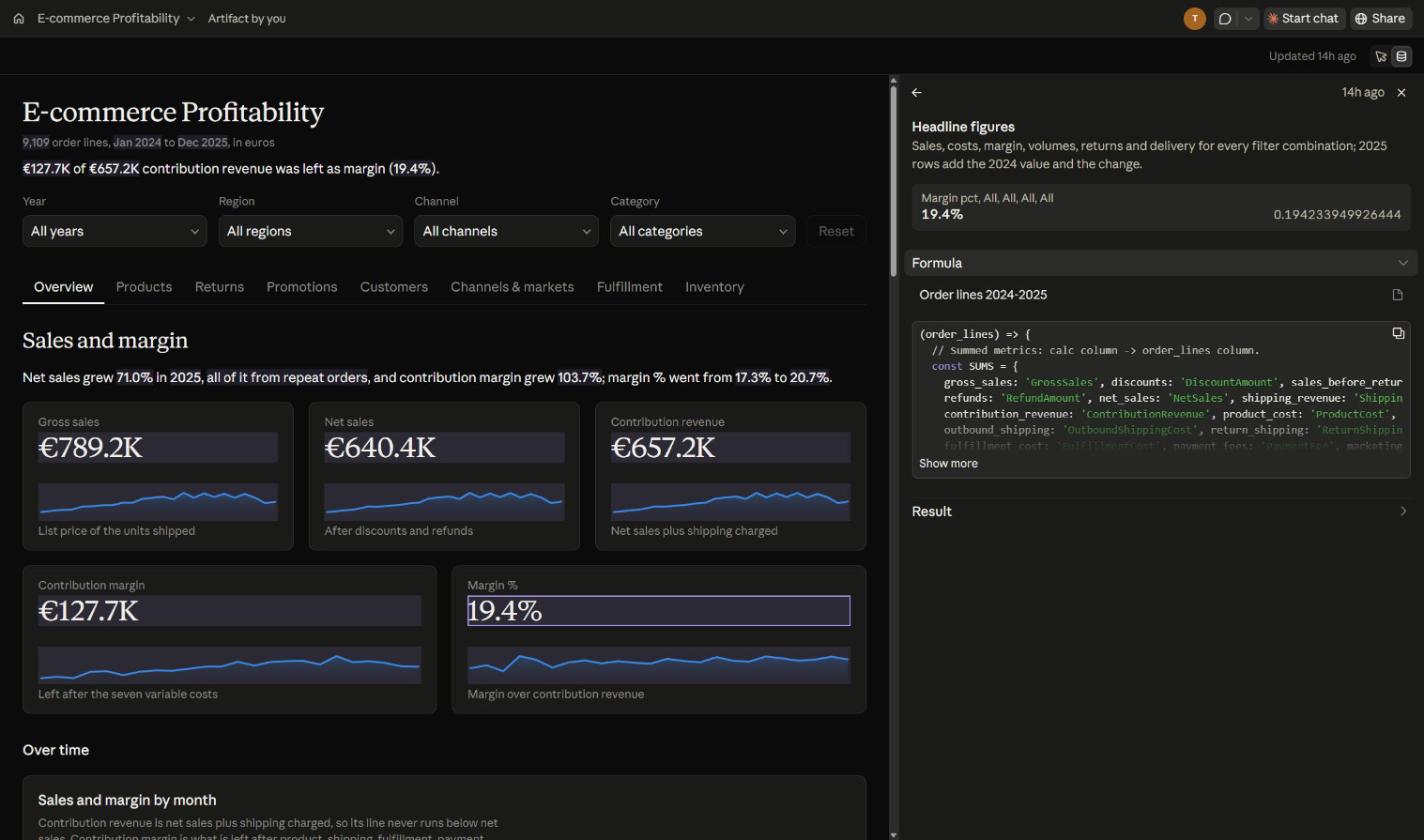
Margin % itself is one line, row.margin_pct = ratio(row.contribution_margin, row.contribution_revenue), but that line sits inside a 148-line calc that works out every headline metric for every combination of the four filters’ values (each filter either “All” or one value). Here’s a trimmed excerpt; my /* ... */ notes mark what I cut:
dash.calc('kpis', {
  inputs: ['order_lines'],
  title: 'Headline figures',
  /* ... a one-line description ... */
  fn: (order_lines) => {
    // Summed metrics: calc column -> order_lines column.
    const SUMS = {
      gross_sales: 'GrossSales', /* ... */ net_sales: 'NetSales', /* ... */
      contribution_revenue: 'ContributionRevenue', /* ... */
      contribution_margin: 'ContributionMargin', /* ... 20 columns in all ... */
    };
    /* ... give every filter value an integer code ... */
    for (let i = 0; i < n; i++) {
      /* ... read this order line's values ... */
      for (let m = 0; m < 16; m++) {
        const g = (((m & 8 ? y : 0) * nR + (m & 4 ? r : 0)) * nC + (m & 2 ? c : 0)) * nK + (m & 1 ? k4 : 0);
        /* ... add the line to slice g ... */
      }
    }
    const ratio = (a, b) => (b ? a / b : null);
    /* ... one output row per slice ... */
      row.margin_pct = ratio(row.contribution_margin, row.contribution_revenue);
    /* ... then 2025 against 2024 for every 2025 slice ... */
  },
});
To be fair to Claude, that’s not padding. My dashboard’s data is an attached file, which a filter can’t re-query, so the page’s own code has to work out every slice up front. The plain claude.ai run landed on exactly the same structure. On a live query the database would do that work instead: a date, a search or a long list goes straight into the SQL, and short pick-one lists like these four filters become a GROUP BY that returns every option’s rows.
In Power BI the same number is three measures, and the model’s filter context handles every slicer for free:
Contribution Margin = SUM ( FactOrderLine[ContributionMargin] )
Contribution Revenue = SUM ( FactOrderLine[ContributionRevenue] )
Margin % = DIVIDE ( [Contribution Margin], [Contribution Revenue] )
I checked those names against a real model. With the workbook’s FactOrderLine sheet loaded into Power BI Desktop, the three measures return the same €127.7K, €657.2K and 19.4% as Claude’s dashboard; Margin % agrees to 14 decimal places.
Both express the same calculation. Only one of them can be read at a glance, reused by every report on the model and handed to the next developer, though.
Kurt Buhler made the same point after testing Claude Dashboards with Fabric. With a semantic model it worked well (his screenshot shows the DAX behind a number in the Sources pane), but with lakehouses, warehouses or local files it guessed metrics and business logic too often instead of asking. His conclusion is that a good semantic model matters more than ever, and my 148 lines of JavaScript agree with him!
Claude Dashboards vs Power BI at a glance
I checked 30 capabilities, in two halves: building the report, then running it as a platform. Every mark has a note and sources behind it, and they’re all in the full table at the bottom. Click any row to jump straight to its detail.
- Yes
- Partial (the full table says why)
- No
Look at where the marks land. In the top half Claude Dashboards gets six ticks to Power BI’s five: it wins on fitting the screen (one layout that reflows all the way down to a phone) and on showing the query behind a number, and maps are its gap. In the bottom half it’s two ticks, 14 partials and six crosses against Power BI’s 21 ticks, and six of those partials say the same thing: Claude has none of its own, so it borrows the capability from the data source.
How to read the marks
- Licences never lower a mark. What you need to buy is in the notes. Row 30 is the exception, since what a viewer pays is the whole point of it.
- Borrowed is partial. Where a platform has none of its own but uses a connected source’s capability, the mark is partial.
- Preview is partial, unless a generally available route does the job. Claude Dashboards being a beta doesn’t lower its own marks.
- Code that Claude writes counts. Claude’s filters, click-to-filter and drill are page code it writes on documented runtime features, rather than built-in defaults like Power BI’s slicers and cross-filtering. The runtime documents the mechanism they run on, so they get a tick.
- “Not documented” means the vendor’s docs say nothing either way.
- Every mark had to survive a sceptical Power BI developer and a sceptical Anthropic employee.
Cost and licensing: harder to compare than it looks
Row 30 (what someone has to pay to see the report) is partial on both sides, for different reasons. On Claude, nobody sees data without a Claude sign-in, and live data only reaches people inside the owner’s Team or Enterprise organisation. On Power BI, free viewing needs an F64 (or P) capacity or bigger; otherwise every viewer needs Pro or Premium Per User.
| Product | List price, USD, as of 15 Oct 2026 |
|---|---|
| Claude | No separate charge for dashboards: they count toward your plan’s usage, and they’re not on the Free plan. Pro US$20 a month (US$17 billed annually), Max from US$100, Team Standard US$25 a seat monthly (US$20 billed annually), Enterprise US$20 a seat a month billed annually, plus usage at API rates. (Claude pricing) |
| Power BI + Fabric | Pro US$14 and Premium Per User US$24 per user a month, paid yearly. Fabric F2 US$262.80 a month pay-as-you-go (US$156.33 reserved); F64 US$8,409.60 a month (US$5,002.67 reserved); East US region. (Power BI pricing, Fabric pricing) |
But I’d be careful lining those numbers up against each other. A Fabric capacity buys an organisation a lot more than a way to vibe code visuals: lakehouses and warehouses, Dataflow Gen2, Direct Lake and larger semantic models, Fabric Apps, Activator alerts and, from F64, free viewing for everyone. A Claude seat buys a general-purpose assistant that also happens to build dashboards. Neither price tag is really the price of a dashboard, so I haven’t tried to force a winner on this one.
So, should Power BI be worried?
Not really. I think the two end up working together.
For building the report, Claude Dashboards is already very good, at least with a mature setup behind it (the plain chat run was a lot weaker). My dashboard is genuinely useful, it reflows down to a phone and every number shows its working. For a quick, exploratory question (which is how Anthropic pitches it) that’s a great fit.
But the dashboard is the last step. The semantic model, RLS, refresh, deployment, lineage, sensitivity labels, subscriptions and embedding are Power BI’s half of the table, and Claude Dashboards has no version of its own for most of them. Its own template even notes that a query through a connector’s governed or semantic definitions gives the number people get when they ask elsewhere. In other words, the best Claude dashboard sits on top of a good semantic model, and building and running semantic models is exactly what Power BI is for.
The catch today is plumbing. Kurt reports that a live connection to a Fabric semantic model needs a remote MCP server, which you can host yourself, because Microsoft’s own remote MCP servers don’t currently work for live dashboards (Claude’s custom connector guide covers the Claude side). Once that gets easier, I can see plenty of teams using both: Power BI for the governed model and the reports everyone relies on, and Claude for quick questions on top of the same model.
Changelog
- 15 Oct 2026: published.
Appendix: the full comparison
Every capability with its marks, notes and sources, as of 15 October 2026. The marks follow the rules under How to read the marks. Each source key links straight to its page, and the full list is under the table.
| Capability | Claude Dashboards beta | Power BI + Fabric |
|---|---|---|
| Building the report | ||
| 1Natural-language authoringDescribe the report in words and it gets built.Back to the summary | Yes The core workflow: ask in plain language and Claude writes the queries and builds the dashboard. A1 A2 | Yes Copilot builds report pages over a model (F2+ or P1+); agents build models and reports with Microsoft’s Authoring MCP and skills (GA; hosted preview). B17 M2 M6 |
| 2Chart freedom and custom visualsAny chart you can describe, or only built-in and marketplace visuals.Back to the summary | Yes Any chart, control or interaction the page’s own code can draw, with d3 v7; no network access, modules or React in the page. A9 | Yes Core visuals, certified and organisational custom visuals, Python and R visuals, and Deneb (Vega and Vega-Lite, certified). B24 B42 |
| 3MapsPlot data on a map, from points to filled regions.Back to the summary | Partial The d3 kit has no projections, base maps or geocoding; a map must be hand-drawn, from boundary data attached as a dataset (inference). A9 | Yes Azure Maps visual (needs the tenant switch) and shape map, which plots up to 1,500 data points. B34 B41 |
| 4Filters and interactivityViewers narrow the data with filters, click one chart to filter the others, drill into detail and hover for exact values.Back to the summary | Yes Filters and click-to-filter are runtime parameters (dash.params) re-running the queries naming them; Claude codes drill, highlighting and tooltips on them. A9 A2 D1 | Yes Slicers and a Filters pane; visuals cross-filter and cross-highlight by default; drill down, drillthrough to detail pages, and report page tooltips. B43 |
| 5Multiple pagesOne report holds several pages, with tabs, buttons or links to move between them.Back to the summary | Yes Tabs are sections of one page that its script shows one at a time, each with its own link; my dashboard has eight tabs. A9 D1 | Yes A report has one or more pages shown as tabs; page navigator buttons; drillthrough pages; synced slicers carry selections across pages. B44 B43 |
| 6Fit to screenThe report stays readable from a wide monitor to a phone.Back to the summary | Yes One layout for every width, by the type’s rules: no fixed widths, redrawn as the width changes, readable at about 400 px. A9 D1 D2 | Partial Pages scale rather than reflow (Fit to page, Fit to width); responsive slicers; per-page phone layouts, auto-create available, show only in mobile apps. B45 B22 |
| 7The query behind a numberClick a number and see how it was worked out.Back to the summary | Yes Click any number to open its query, transform and result, its calc’s JavaScript, or its attached file, in Sources; Claude can explain it. A1 A2 A9 | Partial Authors copy each visual’s DAX in Performance Analyzer; viewers see underlying rows; no viewer-facing query view found; Copilot with Fabric IQ can show DAX. B33 M6 |
| 8Collaboration and commentsSeveral people work on the same report and discuss it in place.Back to the summary | Partial Anthropic says teams and Claude work on the same dashboard; editors ask Claude or edit queries in Sources; comments; presence; simultaneous editing not documented. A1 A9 A4 A5 | Partial Comments with @mentions; several people can edit a semantic model on the web at once; no real-time report co-editing found. B32 M6 |
| Running it as a platform | ||
| Data | ||
| 9Data sources and live queryWhat it connects to, and whether it queries the source live rather than a copy.Back to the summary | Yes Redshift, BigQuery, ClickHouse, Databricks, Snowflake, other connectors and custom MCP; live queries run on each reader’s own connection; files: CSV, TSV, JSON. A1 A2 A3 A9 | Yes Power Query connectors in Desktop and Dataflow Gen2; Import, DirectQuery and composite models; Direct Lake reads OneLake Delta tables on capacity. B36 B7 B10 B2 |
| 10On-premises dataReach data that sits behind a company firewall.Back to the summary | Partial None of its own; a remote MCP server reachable from Anthropic’s cloud, so a private network must allowlist Anthropic’s IP addresses; no gateway documented. A7 | Yes On-premises data gateway (standard and personal mode) and VNet data gateway (P, F and A4+ SKUs); Direct Lake can’t use a gateway. B13 B2 |
| 11Managed storage and data volumeSomewhere inside the platform to keep data, and how much a report can handle.Back to the summary | Partial Storage: attached files up to 8 MB, no warehouse documented; volume: results load in each viewer’s browser, and any over 8 MB is refused. A9 | Yes Storage: OneLake lakehouses and warehouses (F, trial or Fabric-enabled P capacity); volume: model memory 1 GB (Pro) to 400 GB (F1024+). B8 B9 B14 B38 |
| 12Reusable data prepData cleaned and shaped once, in dataflows or Prep flows, then shared by many reports.Back to the summary | Partial None of its own; dashboards can reuse views or models the source already shares; a loader only reshapes one connector’s answer. A9 | Yes Dataflow Gen2 on Fabric, trial or Premium capacity; legacy Gen1 dataflows also work on Pro, without linked or computed tables. B7 B37 B36 |
| 13Write-backUsers change data from inside the report.Back to the summary | No Dashboard SQL is one read-only SELECT or WITH statement; write keywords are refused and the page API documents no write action. A9 | Yes Translytical task flows (GA April 2026) call User Data Functions that write to Fabric SQL databases, warehouses or lakehouse files, or call external APIs. B18 |
| Model and logic | ||
| 14Reusable semantic modelMetrics defined once and used by many reports.Back to the summary | Partial None of its own; the template suggests a connector’s governed or semantic definitions; Kurt Buhler queried a semantic model live through a custom connector. A9 P5 | Yes Shared semantic models reused across reports and workspaces through Build permission; the same models ground Copilot, Fabric IQ and MCP clients. B5 M2 |
| 15Where business logic livesWhere a metric's formula is written, and whether every report can reuse it.Back to the summary | Partial Per dashboard, in each dataset’s SQL or a JavaScript dash.calc readers see; reuse: none of its own, only the source’s views or semantic layer. A9 | Yes DAX measures, calculation groups and user-defined functions (GA June 2026) in the model; visual calculations stay on one visual. B25 M2 |
| 16Query a Power BI or Fabric semantic modelBuild on a Power BI semantic model someone already maintains, with its measures and security.Back to the summary | Partial Custom connector; Kurt Buhler reports Microsoft’s remote servers don’t currently work for live dashboards, so live use needs a remote server you can host. P5 A7 | Yes Native; also XMLA (Premium, PPU, Embedded), the executeQueries API and Fabric IQ MCP (GA), which keeps RLS and OLS. M1 M14 B40 |
| Refresh | ||
| 17Scheduled and incremental refreshData updates on a timetable without anyone opening the report, reloading only what is new.Back to the summary | Partial Live queries re-run per view; files refresh on a scheduled Claude routine (research preview, run on one person’s account and usage); incremental not documented. A9 A10 | Yes 8 a day on Pro (2-hour limit), 48 on PPU or capacity; no fixed count via XMLA or API there; incremental refresh includes Pro. B11 B12 B40 |
| Security | ||
| 18Row-level securityEach viewer sees only their rows from one shared model.Back to the summary | Partial None of its own; source rules apply per viewer if the connector signs each person in; files and saved rows reach every signed-in viewer. A9 A4 A7 P1 D3 | Yes DAX roles, including dynamic USERPRINCIPALNAME rules, filter Viewers but not workspace Admins, Members or Contributors; OneLake security (GA May 2026) adds data-layer rules. B1 B3 |
| 19Column and object securityHide columns or whole tables from some viewers.Back to the summary | Partial None of its own; only what the source enforces on each viewer’s connection; files and saved rows have none. A9 A7 | Yes OLS hides tables and columns, including their metadata, from Viewers; OneLake security adds column-level rules at the data layer. B4 B3 |
| 20Sensitivity labels and DLPLabels that follow the data, and rules that stop it leaking.Back to the summary | No Not documented; HIPAA-ready organisations can turn Dashboards on, but it sits outside the BAA, so keep PHI out. A5 | Yes Purview labels with downstream inheritance and export protection; DLP for import-mode models and Fabric items on capacity, not DirectQuery; restrict-access action in preview. B27 |
| 21Audit logsA record of who viewed or changed what.Back to the summary | Yes Enterprise only: the audit log and Compliance API record artifact publishes, sharing and deletes, and the API records views (claude_artifact_viewed); Team plans have neither. A6 A12 A5 A8 | Yes Fabric and Power BI activities are recorded in the Purview audit log; the Activity Events admin API covers the last 28 days. B28 B26 |
| Lifecycle | ||
| 22Version controlThe report's source kept in Git, with history you can roll back.Back to the summary | Partial Editors can restore an earlier version of a live query in Sources; whole-dashboard version history and Git not documented. A9 | Yes PBIP, PBIR and TMDL files are GA, in any Git repo; Fabric Git integration labels Power BI items preview; models keep five versions. B16 M6 B32 |
| 23Dev, test and prod promotionMove a report through test stages before people rely on it.Back to the summary | No Not documented; the docs describe no stages, environments or promotion. A2 A9 | Yes Fabric-cicd or Fabric item APIs (no preview label) deploy PBIP reports and models to dev, test and prod workspaces; deployment pipelines label them preview. B47 B46 B15 |
| 24Lineage and endorsementSee what feeds what across reports and models, and mark trusted content.Back to the summary | No No cross-item lineage or endorsement documented; the Sources pane traces numbers within one dashboard (row 7). A9 | Yes Lineage view and cross-workspace impact analysis; Purview scans bring in Fabric lineage; promoted, certified and master data endorsement. B26 B39 B6 |
| Distribution | ||
| 25Mobile appsPhone and tablet apps for viewing reports.Back to the summary | Partial The iOS and Android apps view artifacts (dashboards not named); connected apps are web and desktop only, so live data on phones isn’t documented. A3 A5 | Yes Power BI apps for iOS and Android phones and tablets show reports and dashboards, with data alerts. B22 |
| 26Export and hand-offGet the report out as PDF, PowerPoint or Excel, or move it to another tool.Back to the summary | Partial CSV of each source’s rows where downloads are allowed; Export sends it to nine other tools, Tableau “coming soon”; PDF, PowerPoint or image export not documented. A9 A4 A1 A3 D1 | Yes PDF, PowerPoint (image or live), Excel up to 500,000 rows, CSV, Analyze in Excel, exportToFile API; paginated reports for pixel-perfect output. B23 M6 B19 |
| 27Subscriptions and alertsScheduled emails of the report, and alerts when a number crosses a line.Back to the summary | No Not documented; the only documented timer is a scheduled Claude routine (research preview, run on one person’s account and usage) refreshing a file’s rows. A9 A1 A2 A3 A10 | Yes Email subscriptions (dynamic per recipient on capacity), dashboard tile alerts, and Fabric Activator alerts (Fabric capacity) on report visuals by email or Teams. B20 |
| 28EmbeddingPut the report inside your own app or website.Back to the summary | No Embed code exists only for legacy artifacts published from a chat; nothing documented for dashboards. A4 | Yes Power BI Embedded (app owns data; app users need no Power BI licence), secure embed with sign-in and RLS, and public Publish to web. B21 |
| 29Sharing outside the organisationShow the report to clients, partners or the public.Back to the summary | Partial Shared by link (file-only dashboards) or email invitation (beta), but no data shows without a Claude sign-in (tested); live queries don’t run for outsiders. D3 A4 A5 A6 | Yes Entra B2B guests view with Pro or PPU, or free on Premium capacity; Publish to web is public, without sign-in, RLS or DirectQuery. B30 B21 |
| Cost | ||
| 30Viewer licensingWhat someone has to pay to see the report.Back to the summary | Partial No data shows without a Claude sign-in (tested); live data only inside the owner’s Team or Enterprise org (seats from US$20 a month). D3 A4 A5 A8 | Partial Free viewers need F64+ or P capacity; otherwise Pro (US$14) or PPU (US$24) each, and PPU workspaces need PPU. B9 B31 B35 |
Sources
Read on 10 October 2026, with Anthropic’s pages, the dashboard template, the Microsoft pages behind row 23 and the prices read on 15 October too. Keys without a public page link to their entry here.
Anthropic
- A1Anthropic, "Build live dashboards and animate explainers with Claude"
- A2Claude Help Center, "Get started with Claude Dashboards"
- A3Claude Help Center, "What are artifacts and how do I use them?"
- A4Claude Help Center, "Share artifacts"
- A5Claude Help Center, "Artifacts admin guide for Team and Enterprise plans"
- A6Claude Code Docs, "Share session output as artifacts"
- A7Claude Help Center, "Get started with custom connectors using remote MCP"
- A8Claude pricing page
- A9Anthropic's dashboard template documentation, served with the Dashboard artifact type (not public)
- A10Claude Code Docs, "Automate work with routines"
- A12Claude API Reference, "Query compliance activities"
Press and other people
- P1Frederic Lardinois, The New Stack, "Claude can now build your dashboards"
- P5Kurt Buhler, LinkedIn post on Claude Dashboards with Fabric
Microsoft
- M1"Get started with the Fabric IQ MCP server"
- M2"Overview of the MCP Servers" (Power BI)
- M6Katie Murray, "Power BI September 2026 Feature Summary"
- M14"Datasets: Execute Queries" REST API reference
Microsoft: Power BI and Fabric docs
- B1Row-level security
- B2Direct Lake overview
- B3OneLake security GA post (Aaron Merrill)
- B4Object-level security
- B5Semantic models across workspaces
- B6Endorsement
- B7Dataflow Gen2
- B8OneLake
- B9Microsoft Fabric licences
- B10Semantic model modes
- B11Data refresh
- B12Incremental refresh
- B13On-premises data gateway
- B14Capacity and SKUs
- B15Deployment pipelines
- B16Git integration
- B17Copilot in Power BI
- B18Translytical task flows
- B19Paginated reports in the Power BI service
- B20Subscriptions
- B21Embedded analytics
- B22Mobile apps
- B23Export: PDF
- B24Custom visuals
- B25Visual calculations
- B26Lineage
- B27Sensitivity labels
- B28Track user activities
- B30Entra B2B
- B31Features by licence type
- B32Comments
- B33Performance Analyzer
- B34Azure Maps visual
- B35Power BI pricing
- B36Power BI data sources
- B37Power Query, "What licences do you need to use dataflows?"
- B38Premium Per User FAQ
- B39Microsoft Purview, "Connect to your Microsoft Fabric tenant"
- B40XMLA endpoint and client tools
- B41Shape map
- B42Python visuals
- B43Report interactivity: slicers
- B44Report pages: reports in the service
- B45Page display and mobile layout: page display settings
- B46CI/CD workflow options in Fabric
- B47Deploy Power BI projects (PBIP) using fabric-cicd
My own material
- D1My Claude dashboard, E-commerce Profitability
- D2My build notes for this article, 10 Oct 2026 (not public)
- D3My signed-out tests of the dashboard link, 10 and 15 Oct 2026, and its share settings (not public)
Want a semantic model both tools can trust?
Claude Dashboards and Power BI both get better on top of a good model. If yours needs building or untangling, that’s what I do for a living.